Visual Design

Upgrade Returns

(A)

From the end of 2021 to the beginning of 2022, I collaborated with UX designer Jingyao to upgrade the interaction and visual design for Returns Shopper. Consumers may use Returns on any platform or offline to process returns and exchanges, so it is our responsibility to make the process smoother and more visually appealing, helping businesses reduce reputation and product losses. The success of this role signifies the collaboration between our platform team, centralized brand team, and every editor and their design team.

Most of the projects showcased here focus on redesigning the user interface to better showcase how Returns Shopper can support any brand language. Based on AfterShip's "mobile-first" rule, the projects will especially emphasize the mobile domain.

(B)

Returns, as AfterShip's second-largest product, has become one of the company's key projects. As a follower of the agile development spirit, I joined Returns to help enhance the visual representation for the Shopper side, particularly on mobile devices, midway through the project. With the coordination of design resources within the company, I assisted in collaborative platform projects. However, I am still proud to have contributed to the successful launch and iteration of Returns.

(C)

- Role: UX Designer 2021-2023.

Preface

The Returns product is divided into two parts: Admin, where merchants (B-end users) can manage their returns and exchange situations and set rules, and Shopper, where merchants can use the CSM framework provided by Returns to showcase brand return and exchange pages to their customers (C-end users). In 2021, the Returns team was established as the company's second-largest product, with more resources being allocated for team expansion and sales upgrades.

At the end of 2021, I collaborated with Returns to conduct a visual upgrade for Returns Shopper. Our goal was to drive the overall brand expression for Shopper, designing shared component modules based on popular conventions. For example, if a website like Dyson needs a page module for returns and exchanges, we can use it as a point to express its brand design, enhancing the voice of the Dyson brand.

During the design research phase, we studied each brand and their audience's expectations. With the expectation being user-centric, upon completion, our Shopper did not feel like purely generic CMS design elements. Instead, it presented a complete visual representation driven by the brand of each user.

Nowadays

AfterShip Returns is a product return management system launched by AfterShip in 2018, aimed at helping e-commerce businesses simplify and optimize the return process, improve customer satisfaction, and operational efficiency.

After several years of growth and development, Returns has become an essential and integral part of AfterShip. With the rapid growth of the e-commerce industry (especially during the pandemic era) and increasing competition, return management has become increasingly important. Returns is not just a simple return processing system; it has evolved into a comprehensive return solution covering various aspects such as return requests, return logistics, refund processing, customer communication, and more, allowing e-commerce businesses to handle returns more efficiently. Through AfterShip Returns, e-commerce businesses can provide a more convenient return process, reduce customer complaints and disputes, enhance brand reputation, and improve customer loyalty.
[fig 1]
In 2021, Returns began collaborating with small and medium-sized enterprises (SMEs) and large enterprises (Enterprise) users, marking the product's transition into a mature phase. By adopting a Product-Led Growth (PLG) strategy, Returns is able to better cater to the needs of customers of different scales and provide more personalized and professional services to them.
[fig 2]
However, following the PLG strategy, Returns has encountered bottlenecks in its journey towards maturity. The main challenge lies in the strategy of attracting SMEs with low prices reaching its limits (some partner companies even admitted that they chose us because of our low price advantage). Additionally, the product features and user experience are not convincing enough for Enterprise users to make a purchase. Such a strategy can also lead to several negative impacts:

- The user experience and value of the product are crucial. Over-reliance on low prices may diminish the product's value and user experience, affecting user satisfaction and loyalty.

- Low prices often attract price-sensitive users, but these users may not be highly loyal and are more likely to switch to products with even lower prices.

To further drive the development of Returns, we need to enhance its product features and user experience to increase its value and competitiveness. This will help attract more users and retain them in the long term.

Returns Part

[fig 3]
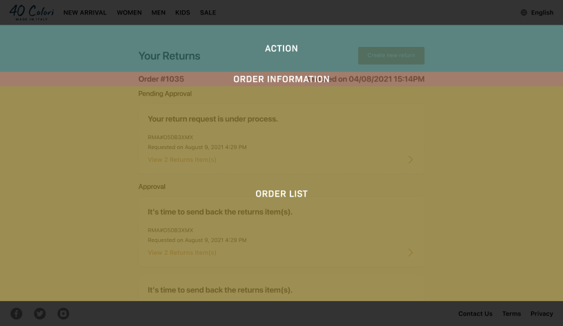
The Returns product is divided into two parts: Admin and Shopper, serving merchants and users respectively:

Admin Part: Merchants can manage their returns and exchange situations and set rules in the Admin part. Through the Admin part, merchants can easily track return and exchange orders, manage the return process, set return and exchange rules and policies, etc. This can help merchants improve the efficiency and management level of returns and exchanges.

Shopper Part: Merchants can showcase their brand's return and exchange page to their users through the CSM framework provided by Returns. Through the Shopper part, merchants can customize the style, content, and functionality of the display page to enhance brand image, improve user experience, and also help users to easily carry out return and exchange operations.

Through the collaborative efforts of the Admin and Shopper parts, the Returns product can help merchants better manage the return and exchange process and enhance brand image, while also providing a high-quality return and exchange experience to users, achieving a win-win outcome.

How does Returns help different brands achieve their brand value?

Returns Shopper helps merchants establish brand identity through CMS. Content Management System (CMS) is a software system used to manage and publish online content. It allows users to create, edit, organize, and publish text, images, videos, etc., without the need for specialized programming knowledge. Merchants can easily create, update, and maintain their brand website through Shopper.
[fig 4]

"Shopper" is an old man

In comparison to the Admin designed based on the Shopify Polaris component library, the Shopper page design style appears more like a shopping webpage from ten years ago, lacking modern design elements and user experience.
[fig 5] Design Flaws
[fig 6] Old Style
[fig 7] Chaotic layout
[fig 8] Mobile is not friendly
Our strategy for addressing the issues of outdated design style, lack of standards, visual inconsistency, and lack of brand identity is as follows:

- Redesign Shopper style: Redesign the pages using a modern, clean design style that focuses on user experience and visual appeal. We can reference current design trends and styles to ensure the pages look more modern.

- Introduce design standards: Establish design standards and style guides to ensure that the design style, colors, layout, icons, and other elements of the pages adhere to a unified standard. This can enhance the overall quality and consistency of the pages.

- Visual consistency: Ensure that the visual elements such as elements, colors, fonts, layout, etc., in the pages are consistent to enhance the overall visual effect and quality of the pages, thereby improving user experience and brand image.

- Strengthen brand identity: Consider popular brand styles in page design to strengthen brand identity and recognition. Our ultimate goal is to enhance the brand image and deepen user awareness and trust in the brand through branded design.
Before starting the visual optimization project, I collaborated with the designer Jingyao to thoroughly analyze the current pages and logic of the Shopper platform. We aim to address all existing issues comprehensively and enhance the visual appeal and user experience of the Shopper platform. Our goal is to achieve better page design and showcase a strong brand image.
[fig 9]
We have researched various popular styles, such as fast-moving consumer goods (FMCG). The style of FMCG typically features vibrant, bold, clean, and easily recognizable characteristics, aiming to capture consumers' attention and drive purchase behavior.
Through analyzing the main competitors, we have identified the key points of differentiation for our product and have established an optimization plan.
[fig 10]

Before we started

We initiated the process by creating a "Brand Guide" document that presents the core principles and visual style of the brand. This document will help us further drive the aspects of brand expression and present mood boards with each brand's capabilities on the Shopper pages.
[fig 11]
For example, 40 Colori has some visual signatures: it uses a serif font throughout its design for the logo, employs a lake blue color to convey a vintage tone and reflect the essence of handmade style, and combines clean sans-serif fonts with classic fonts. The lake blue and bright orange are used to highlight clothing elements on the webpage.

By leveraging these characteristics and recombining them, we can create a more focused, specific, and unique brand image that more clearly reflects what makes 40 Colori a provider of premium clothing. These elements are sufficient to stay true to its brand.

We have gone through the process of tidying up the layout of each page on Shopper and enhancing the brand image.

We have discovered that many brands have unique audiences and styles, and our Shopper framework should be able to adapt to these variations. We aim to create a design that supports the details and styles of each brand.

Enhancing User Experience and Visual Appeal

The optimized version of the Page builder has significantly improved the user experience, with feedback indicating that the page layout is clearer, operations are smoother, and overall usability has been greatly enhanced.

The system's response speed has notably increased, allowing users to access information more quickly, reducing wait times, and enhancing the user experience with the Page builder.

The increase in user traffic and retention rates indicates that the optimized version of the Page builder has attracted more attention from users, while also increasing user stickiness and loyalty, laying a solid foundation for the long-term development of the website.
[fig 12]
When users search for orders that require return services, we will reorganize the modules and utilize card design to differentiate between different modules. This will help users to visually distinguish between order information and statuses more intuitively, enabling them to quickly initiate return actions. This approach will enhance user experience and reduce the likelihood of confusion during operations. Additionally, the card design will add depth to the overall page layout, making it easier for users to comprehend and navigate through order information.
[fig 13]
[fig 14]
In order to guide users on Shopper to opt for returns or exchanges, merchants are inclined towards encouraging users to express their honest opinions. This approach aims to guide users towards selecting alternative products or exchanges to compensate for any losses incurred by the user and minimize losses for the merchant. To achieve this goal, we will implement the following strategies:

- Listen to User Feedback: While guiding users to select alternative products or exchanges, merchants should actively listen to users' genuine voices and feedback. Understanding the needs and opinions of users and adjusting guidance strategies based on user feedback will enhance user experience and satisfaction.

- Offer Discounts and Services: To attract users to choose alternative products or exchanges, merchants can provide certain discounts and services such as discounts, free gifts, or expedited delivery. By offering additional value, users can be enticed to select alternative products or exchanges, thereby reducing losses for the merchant.

A/B

During the usage of Shopper, we conducted A/B testing on the interaction mode of return reasons and exchange order forms, utilizing two different approaches: Sheet and Modal.

The Sheet style is a form that slides out from the right side of the screen. The operation process is more natural, allowing users to clearly see the changes in the page. It takes up less space, making it easier for users to understand and operate. Additionally, it offers a certain level of customization. This interaction mode may be more suitable for consumer users, as it can enhance user experience and convenience in operation.
[fig 15]
Modal style is a form that pops up directly in the center of the screen, prominently reminding users of the action they need to take. The information is centralized in the middle of the screen, which can increase the interactive appeal and interest. However, this style may cover up the screen content, potentially impacting the user experience and hindering the smoothness of operation.
[fig 16]
Through A/B testing, we can evaluate the strengths and weaknesses of the two interaction styles. By collecting user feedback and analyzing data, we can choose the most suitable interaction style that enhances user experience and satisfaction. In practical use, it is important to consider the features of the product and the needs of users to select the most appropriate interaction style in order to achieve better results.

Mobile Doesn't Have to Be a Compromise

We are also focusing on improving the mobile experience for Shopper, aiming to enhance our visual aesthetics and simplify operational logic. We aim to create a seamless experience and provide the best possible experience for mobile users.

- Ensure that the pages display correctly on different screen sizes, with a well-organized layout and clear content.

- Provide clear logical instructions on the mobile pages so that users can quickly find the information or products they need.

- Adjust the size and spacing of page elements to make them more suitable for browsing on small-screen devices. Ensure that buttons and links are of a moderate size for easy user interaction.
[fig 17]

Enhanced Style Guide

This includes a common component library used in the product, extending to design principles that designers need to adhere to, as well as user experience guidelines for the use and implementation of each section in the product, from form elements to typography and overall screen layout.

The style guide is crucial for our developers and designers as it provides us with a shared component library and ensures consistency in our designs.
[fig 18]

The End Result

The final user experience combines a deeper brand theme and organized page structure, allowing merchants to create a more branded return and exchange system. This visual upgrade integrates brand, visual expression, and user-centered experience, positioning Returns Shopper at the forefront of the return management system experience.
[fig 19]
Next project