Case Study

UX For Page Builder

(A)

AfterShip's Page Builder allows users to create stunning landing pages on Shopify through simple drag-and-drop editing, optimizing their stores' appearance. As one of the UX designers for AfterShip's Page Builder, I am responsible for the MVP launch of the product, page template design, UX/UI optimization, and maintenance of the Figma component library. This project has been a significant part of my growth journey at AfterShip. During my tenure, our team has more than doubled in size, and I am proud of our output, design quality, and team collaboration.

(B)

In fact, not all design work allows designers to fully express themselves, but Page Builder is exactly this type of work. As a designer using Webflow, being able to personally design a page editor is a privilege for me.

(C)

- Role: 2021 UX Designer.
[fig 1]

AfterShip Page Builder: An Overview

Page Builder is an all-in-one page builder that helps merchants optimize their stores with beautiful landing pages. When I joined AfterShip in April 2021, it was still a concept product in the pre-sales stage at AfterShip, and the product development team had just been newly formed. My goal was to brainstorm and conduct preliminary research, design and launch the MVP, and be responsible for template design, some interaction optimizations, and maintaining the Figma component library.Below are some excerpts of the efforts I made in the early stages of the product. Due to the wide range of projects and plans I was involved in, I found it challenging to comprehensively summarize all of my work in Page Builder. Let this serve as a highlight summary, and if you would like to know more details, I would be happy to elaborate in person.

Assessing Viability:MVP

Minimum Viable Product (MVP) is an effective method for evaluating the feasibility of a product or project. By defining core features, resource requirements, market demand, risk assessment, and budget considerations, the direction and scope of product development can be determined, and the feasibility of the product can be validated. MVP analysis helps reduce waste of resources and time, speeding up the product's time to market, while also increasing the chances of success.
[fig 2]
Utilizing the Minimum Viable Product (MVP) approach is crucial for the design and launch of a new product. The concept behind MVP is to develop a basic product prototype in the shortest time possible to validate the product concept and market demand. Designing Pagebuilder, a page editor, using the MVP methodology can bring about several benefits:

- Time and Cost Savings: The MVP design approach allows teams to focus on developing core features, avoiding unnecessary functionalities and complexity, thus saving time and costs.

- Rapid Feedback and Iteration: Through MVP, products can be quickly launched to the market, enabling the collection of user feedback and data for timely product adjustments and improvements, facilitating rapid iteration.

- Ensuring Market Demand: MVP helps teams validate product concepts and market demand, preventing the development of products that lack consumer interest and ensuring the effective utilization of resources.

The Significance of User Experience in MVP

A comprehensive and effective user experience design is indispensable during the MVP launch phase. Its importance lies in ensuring the usability of core product functionalities, collecting user feedback to validate assumptions, enhancing user engagement and retention, and reducing product risks and costs. By focusing on user experience design, a solid foundation can be laid for the success and continuous development of the product.
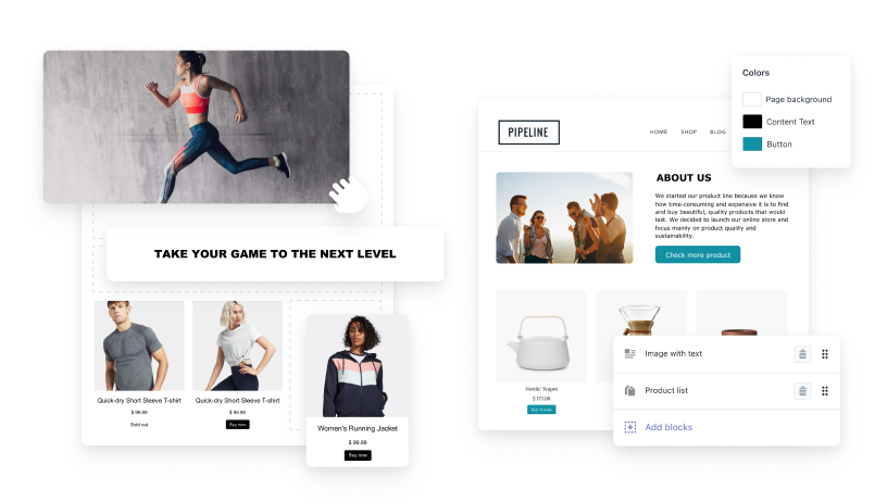
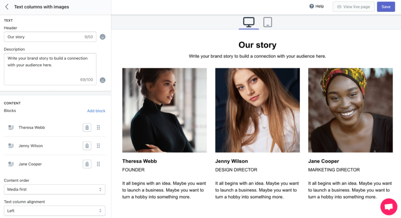
[fig 3] Defining the Problem is More Important than Solving It
Next, I will introduce the efforts we have made in the MVP design process. Through carefully crafted Minimum Viable Product (MVP) design, we will present to you a meticulously polished product prototype aimed at validating the product concept and market demand. Not only have we saved time and costs (completing the project from inception to launch in just two months!), but also ensured that the product meets user needs and remains competitive through rapid feedback and iteration. Let us explore together the efforts made in the MVP design process, hoping to bring you some inspiration.

Issue: Missing Hub in the Product Matrix

In 2021, AfterShip, a B2B SaaS company serving the international e-commerce sector, secured a substantial $66 million funding from Tiger Global and Hillhouse Capital. The company's product offerings span various aspects of pre-sales and post-sales processes for merchants, including logistics tracking, email marketing, and return services. Its primary clientele are businesses on the Shopify platform.

Within its post-sales operations, AfterShip's Tracking service is responsible for parcel inquiries, while Returns handles the returns and exchanges processes. Pre-sales activities involve Email and Review Dropshipping, among others. By aggregating a variety of products that cover most stages of e-commerce sales, AfterShip has established a product matrix.

However, it appears that there is a missing hub within this product matrix, which could potentially serve as a central point connecting and enhancing the functionalities of the various services provided. Identifying and filling this gap could lead to a more comprehensive and seamless user experience, as well as potentially unlocking new opportunities for AfterShip's growth and market positioning.
[fig 4] 2020 Product Matrix
Why focus on the majority rather than all? It is because there has been a missing link in the B2B e-commerce sales process, where direct involvement in building their e-commerce websites has been lacking. This gap has resulted in our products not covering the entire e-commerce sales process, hence the need to fill this void.

The significance of this aspect lies in providing retailers with an agile page editor for brand promotion and conversion. Well-designed landing pages can enhance lead acquisition and sales conversion rates, helping B2B merchants achieve success. By having such a page editor, we can offer customers a more comprehensive solution, enabling them to better manage their e-commerce websites and improve business performance. Filling this gap will add value to our product matrix, enhance customer satisfaction, and expand our market share.
[fig 5]
Our entry into the market also signifies the potential for increased ARR (Annual Recurring Revenue).
[fig 6] 2023 Product Matrix
By aggregating our product matrix, we can fill in the areas that are currently not covered by our products, enhancing the comprehensiveness and competitiveness of our product line. For example, directly integrating email and review functions for marketing activities, recommending dropshipping for order fulfillment on the B2B side, and providing after-sales one-stop support can all help improve our product matrix and better meet the needs of our customers.

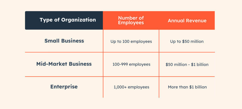
Uncovering Customer Profiles: Our Target User Group

In 2020, with the arrival of the pandemic, e-commerce entered a period of vigorous development. In the situation of people being isolated from each other, a large number of individuals flocked to platforms like Shopify to set up their own independent websites, hoping to realize their entrepreneurial dreams.

Through data comparative analysis, we found that in 2021, the vast majority of users using our product are small and medium-sized businesses (SMBs). Therefore, the initial target of our Page Builder is to serve this group. These small and medium-sized businesses aim to use our tools to create personalized web pages, enhance user experience, attract more customers, and achieve business growth goals. Let's delve deeper into understanding these target users and provide them with better service and support!
[fig 7]
Based on the results of user research, we have summarized the common characteristics of our target user group:

- Mainly individuals or small B2B businesses (SMBs)
- Have a certain level of design skills but are not familiar with coding
- Lack design skills or cannot afford to hire a designer, hoping to create attractive websites
- Lack time to learn complex page editors

By gaining a deeper understanding of the needs and pain points of our users, we are committed to providing a simple and user-friendly Page Builder tool for this group. Our goal is to help them quickly and efficiently create websites that meet their needs, enabling them to achieve their business growth and brand-building objectives.

With a focus on simplicity and ease of use, our Page Builder will empower individuals and small B2B businesses to design and customize their websites without the need for coding knowledge or expensive design services. By offering intuitive features and templates, we aim to streamline the website creation process and support our users in achieving their online presence goals effectively.

Understanding user pain points

After thorough preparation, the team conducted a workshop and mapped out the user journey.

The results of the mapping exercise revealed that novice users become overwhelmed when faced with complex editors, leading to potential decreases in willingness to pay and increased user churn.
[fig 8]
In response to this discovery, we need to focus on the simplicity and usability of the user experience, striving to provide an intuitive and straightforward interface that helps users easily and quickly complete web page editing tasks. This will enhance user satisfaction and retention rates.

By prioritizing a clean and user-friendly design, streamlining the editing process, and offering clear and easy-to-understand instructions, we can make it easier for users, especially novices, to navigate the platform and accomplish their tasks efficiently.

Additionally, incorporating user-friendly features such as drag-and-drop functionality, inline editing, and real-time previews can further enhance the editing experience and empower users to create and customize content with ease.

Developing strategies and planning for Product-Led Growth (PLG)

PLG, short for Product-Led Growth, is a strategy that focuses on driving user growth and market expansion through the product itself. The core concept of PLG is to make the product an engine for attracting, retaining, and growing users by continuously improving the product, optimizing user experience, and providing value-added services to achieve growth goals.
[fig 9]
PLG emphasizes the critical role of the product in user growth, highlighting the continuous optimization of usability, functionality, and user experience. Compared to traditional marketing and promotion strategies, PLG places greater emphasis on the quality and value of the product itself, advocating for attracting users through the product's appeal and word-of-mouth effect to achieve sustainable user growth and market expansion. PLG has become one of the primary growth strategies for many internet and tech companies, considered to be an efficient and sustainable growth model.
In different stages of product-led growth, it is crucial not to slack off in terms of strategy. Competitor analysis serves different objectives at different stages. Firstly, it is essential to understand the current lifecycle stage of the product and the characteristics of the users.
[fig 10]
Through the analysis of key competitors, we have identified the main differentiating points of our product and discussed them in the workshop.
[fig 11]

How to make users “Have a good time”

In order to optimize the user experience and improve operational efficiency, we have designed the following metrics:

- Provide a clear and concise page selection interface for users to quickly find the type of page they want to create;

- Simplify the operation of dragging and dropping elements to ensure that users can easily place elements on the page;

- Design an intuitive and easy-to-use left-side editing function, allowing users to conveniently edit content and style;

- Add a preview function so that users can see the real-time display of the page on different devices;

- Provide a clear publish button for users to quickly publish the page to their Shopify store.
[fig 12]

Selecting the Best Design Solution and Developing Stages for the Page Builder Product

By collecting design proposals, setting evaluation criteria, conducting comparative analysis, and organizing voting, we have identified the best design solution for the MVP. This solution aligns with the needs of the target users and market trends.
[fig 13]
In order to better assist the growth of the Page Builder, we have planned and designed the product interaction development stages as follows:
[fig 14]

MVP Launched!

After thorough discussions and based on the agreed-upon interaction style, we have identified the company's Email editor as the foundation for developing the page editor to quickly launch the MVP (Minimum Viable Product). The first type of page we are introducing is "About Me", to meet users' demand for narrative content and to validate the market quickly.
[fig 15]
[fig 16]

Product development

After the launch of the Page Builder, we have gradually improved common website layouts, various feature (work with Zoe), and provided a wide range of preset templates.

Same time, we are continuously maintaining a design component library in Figma to ensure consistency and reusability of design styles.
[fig 17]

One Year Later ——

Current Team Status

After a year of development, the Page Builder team has doubled in size, and product updates are running smoothly. The team collaboration has improved significantly, including product managers, UX designers, FE/BE engineers, QA, sales team, and customer support staff. The collaboration of these different roles has provided strong support for the continuous optimization and development of the product.
[fig 18]

Aspiring for Growth

After one year of Page Builder being live, in order to adapt to the changes in the product lifecycle and the evolving user demands, we have decided to revamp the product completely. Through in-depth user research and market studies, we will introduce more innovative features and optimize the user experience in the new version to enhance user satisfaction and increase the product's competitiveness. In the following showcase of our efforts and contributions during the revamp process, we have dedicated a significant amount of time and effort to design, develop, and test new features, ensuring that users can enjoy a smoother and more powerful page building experience.

Company's Pre-sales Strategy: Transition from SMB to SME

In response to the changing market environment and the company's development needs, the company has decided to shift its pre-sales development strategy from targeting Small and Medium-sized Businesses (SMB) to focusing on Small and Medium Enterprises (SME). This transition is based on in-depth market analysis and a profound understanding of customer demands. We believe that dedicating ourselves to serving SMEs will contribute to greater growth and more robust business development for the company.
[fig 19]
During this transition, we will prioritize the needs and pain points of SMEs, providing more specialized and personalized solutions.

As we focus on the small and medium enterprise market, Monthly Recurring Revenue (MRR) and Annual Recurring Revenue (ARR) will continue to grow, providing the company with a more stable and sustainable source of income.

The next stage of PLG

The PLG (Product-Led Growth) strategy that we set during the MVP stage can now be taken to the next level. Over the past year, we have completed the development of common page functionalities modules, and now we need to further optimize the product based on PLG. By leveraging the methodologies and tools of PLG, we can better understand the evolving needs of the product at different stages, make targeted optimizations and adjustments to ensure that the product continues to meet user needs and remains competitive.
[fig 20]

Looking Forward to Better User Experience

Over the past year, our team has collected a significant amount of user feedback and issues through user interviews and feedback. In order to better address this feedback, we have compiled these experience issues and are prepared to make targeted adjustments and optimizations to the product.
[fig 21]

New Design Concept - A More Flexible and Direct Editor

We now have a more comprehensive style guide that includes a common component library used in the product, extending to the design principles that designers need to follow, as well as user experience guidelines for the use and implementation of each section in the product, from form elements to typography and overall screen layout.

The style guide is crucial for both our developers and designers, providing us with a shared component library and ensuring consistency in our design.
[fig 22]
The style guide also provides product design principles and explanations and tutorials on layout, accessibility, and user experience. The Pagebuilder design team consists of designers, including both experienced individuals who have been working for several years and new designers who are getting familiar with the product. The style guide serves as a way to help achieve consensus on common patterns and industry standards.
[fig 23]

Adaptive Rules at Macro and Micro Levels

What is important to me is that the style guide is composed not only of individual UI elements but also includes more molecular components that need to be used in the product experience. With the introduction of elements and more columns, designers have restructured the originally fixed grid structure, which now consists of 12 columns.

When a new element is dragged into the columns, it can adaptively adjust the space occupied by the element and the space occupied by other columns. Additionally, we have optimized the column rules at different breakpoints to ensure excellent performance of the page on different devices. This sets consistent expectations for user behavior.
[fig 24]
[fig 25]
[fig 26]

Adaptive Rules for Complex Blocks

For some complex functionalities, allowing users to customize based on elements may lead to unnecessary complications and increase user understanding costs. For complex features such as countdown timers and product sales pages, we have temporarily retained their interaction logic as blocks inserted into the page, and optimized their visual presentation on various devices.
[fig 27]

Iteration of Interaction Rules

This With the introduction of elements and columns rules, users can do:

- After dragging elements into the left module area, they can directly edit the content on the page.

- Designer Zoe has redesigned the interaction logic, adding elements and columns logic. Now, editing on the page can use Columns to define element width and size, which is more flexible compared to the previous fixed modules.

- By investing time and effort to improve the user experience and design of the Page builder, we will provide users with a unified experience and also offer more customization capabilities for novice users/designers.
[fig 28]
[fig 29]

Improvement in Editing Bar Experience

In the past, we had to use the left editing bar to add and edit blocks/sections because we couldn't directly edit on the right side while browsing the page. This forced users to complete all editing tasks using the left editing bar. The excessive height of the editing bar required users to scroll repeatedly to edit, leading to confusion and negating the possibility of editing while browsing the page. The editing bar also mixed too many types of controls (such as page basic settings), resulting in a cramped and chaotic experience.

With the introduction of elements and columns rules, users can now edit directly on the page. The previous emphasis on editing pages on the left editing bar no longer fits the product development. Zoe has optimized the left editing bar, reducing the burden on users to repeatedly edit content on the left side.
[fig 30]

Iteration on Drag-and-Drop List

Previously, a large number of Block/Section functionalities were added by dragging and dropping through the left editing bar. Zoe has optimized this process by allowing users to directly add Block/Section on the right side of the web page. This improvement not only provides a clearer layout of information on the left editing bar but also enables users to maintain focus on the visual effects of the web page.
[fig 31]

Information Architecture (IA)

With the default Poppins font, we have established clear rules for font sizes that can be applied to any font supported by the Page builder. This has added a clear information hierarchy to our UI, simplifying design decisions and providing users with clear signals about text hierarchy. Additionally, we have made modifications to the default font to ensure better performance on the page.
[fig 32]
Other product teams within the company are still using the Polaris component system for development, which has its own design guidelines and annotation system. I have long desired to design a new annotation system for the page editor, which can help establish a shared understanding of design guidelines across the entire team and assist technical staff in accurately replicating design styles.
[fig 33]

Template Visual Style

We have improved the template filter in Admin, while also carefully optimizing all existing preset templates to align with popular brand standards.
[fig 34]

Conclusion

The optimized version of the Page builder has significantly improved the user experience, with feedback indicating that the page layout is clearer, operations are smoother, and overall usability has been greatly enhanced.

The system's response speed has notably increased, allowing users to access information more quickly, reducing wait times, and enhancing the user experience with the Page builder.

The increase in user traffic and retention rates indicates that the optimized version of the Page builder has attracted more attention from users, while also increasing user stickiness and loyalty, laying a solid foundation for the long-term development of the website.
[fig 35]
Next project